
Watch Dial Selection Guide: Finishes, Indexes, and Compatibility
Why the Dial Matters Most
Case and bracelet get the specification attention, but the dial is what you actually look at. It determines legibility, character, and how the watch reads in different light. For a modder, the dial is also the component with the most choice and the most compatibility constraints.
Dial Size Comes First
Before aesthetics, confirm size. NH35, NH36, NH34, and NH38 movements use 28.5mm dials. Skeleton movements (NH70, NH71, NH72) use 30.8mm dials. These are not interchangeable, and no other specification matters if this one is wrong.
Finish Types
Sunburst
Sunburst dials have fine radial brushing that catches light and shifts tone as the wrist moves. They are the most common finish on modern sports watches because they add visual interest without pattern.
- Character: dynamic, modern, light-responsive
- Legibility: good, provided hands contrast sufficiently
- Caveat: can look flat under diffuse indoor light
Matte
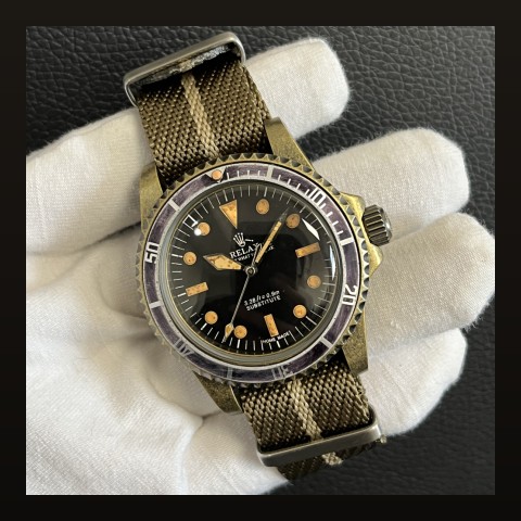
Matte dials absorb light rather than reflecting it. They read darker and more consistent, with excellent legibility.
- Character: tool-like, understated, military
- Legibility: excellent in all conditions
- Caveat: can appear plain compared with textured finishes
Glossy / Lacquer
High-gloss lacquer dials produce deep, rich colour with sharp reflections.
- Character: dressy, vintage-inspired, formal
- Legibility: good, but reflections can interfere in bright light
- Caveat: shows dust and fingerprints more readily
Textured
Waffle, tapisserie, and stamped patterns add depth. They are visually distinctive but require careful hand selection to remain legible.
Indexes and Markers
Applied indexes sit above the dial surface and catch light on their facets. Printed indexes are flatter and cheaper. Applied markers generally signal a higher-quality dial, but the difference is aesthetic rather than functional.
Lume application matters more for practical use. Look for even application without overflow onto the dial surface. Poorly applied lume is the most common quality defect on inexpensive dials.
Date Window Considerations
If your dial has a date window, the movement must match. A date-only dial needs an NH35. A day-date dial needs an NH36. Fitting the wrong movement leaves a window empty or shows a partial disc.
Also check window position: 3 o'clock and 4 o'clock dials require correspondingly positioned movements. Mismatch causes the date to sit off-centre, which is immediately visible.
Hands Must Match the Dial
Hand choice determines legibility as much as the dial does. Three practical rules:
- Contrast: dark hands on a light dial or light hands on a dark dial
- Length: the minute hand should reach the minute track, not stop short
- Style coherence: a vintage dial with modern broad hands looks unresolved
Lume Colour and Performance
Lume is graded by brightness and duration. C3 (green) and BGW9 (blue) are the two most common grades. BGW9 appears white in daylight and glows blue; C3 appears pale green and glows green. Performance depends on application thickness as much as grade, so a well-applied C3 can outperform a poorly applied BGW9.
Practical Selection Process
- Confirm dial diameter against the movement
- Confirm date window type and position
- Choose finish based on intended use: matte for tools, sunburst for daily, gloss for dress
- Select hands for contrast and correct length
- Check lume application quality in photographs before buying
FAQ
What dial size fits an NH35?
28.5mm. Skeleton movements such as the NH72 use 30.8mm dials and are not interchangeable.
Is sunburst or matte better?
Matte offers better legibility and a tool-watch character. Sunburst adds visual interest and suits daily wear. The choice is aesthetic, not functional.
Why does my date look off-centre?
Usually a crown-position mismatch. A 3 o'clock movement in a 4 o'clock case shifts the date window alignment.