
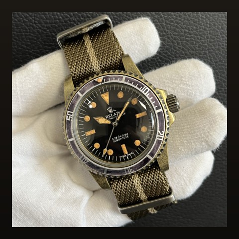
Typography in Dress Watches: How Font Design Elevates Timepiece Elegance

The Hidden Art of Watch Typography
When evaluating a dress watch, most collectors focus on case size, movement, and materials. Yet one of the most critical elements of a dress watch's character often goes unnoticed: typography. According to Watchonista, the fonts used on watch dials contribute significantly to a timepiece's elegance and personality.
The article explores how brands commission custom typefaces specifically for their watches, creating visual identities that become as recognizable as the watches themselves. From the Bauhaus-inspired minimalism of NOMOS Glashütte to the art deco elegance of Cartier, typography plays a crucial role in defining a dress watch's character.
Iconic Dress Watch Typography
| Brand | Font Style | Characteristics |
|---|---|---|
| NOMOS Glashütte | Bauhaus-inspired sans-serif | Clean, modern, highly legible |
| Cartier | Roman numerals with secret signature | Classical, elegant, refined |
| Hermès | Custom Philippe Apeloig typeface | Contemporary, artistic, unique |
| Patek Philippe | Classic serif numerals | Timeless, traditional, prestigious |
| A. Lange & Söhne | German-style serif | Technical, precise, sophisticated |
The NOMOS Glashütte Example
NOMOS Glashütte exemplifies how typography can define a brand's identity. The Tangente, one of the brand's most iconic models, features a clean sans-serif typeface inspired by Bauhaus design principles. This typography choice reinforces the watch's minimalist aesthetic and has become instantly recognizable among collectors.
The brand's commitment to typography extends beyond mere aesthetics. NOMOS commissions custom typefaces that balance legibility with visual harmony, ensuring that every element on the dial contributes to the overall design language.
The Frederique Constant Classics Premiere
The recent Frederique Constant Classics Premiere demonstrates how typography integrates with overall design. As reviewed by aBlogtoWatch, the watch features applied Breguet-style Arabic numerals that reference classical horological traditions while maintaining modern readability.
At $2,395, the Classics Premiere shows how thoughtful typography can elevate a mid-range dress watch. The salmon dial provides a warm backdrop for the carefully chosen numerals, creating a timepiece that punches above its weight class in terms of visual sophistication.
What to Look For in Dress Watch Typography
- Legibility: The font should be easy to read at a glance
- Proportion: Numerals should be appropriately sized for the dial
- Consistency: The typeface should complement the overall design language
- Finishing: Applied indices often look more premium than printed numerals
- Character: The font should contribute to the watch's personality
The Future of Watch Typography
As watch design continues to evolve, typography remains a constant element that connects modern timepieces to horological traditions. Independent brands are particularly pushing boundaries, experimenting with unconventional typefaces that challenge classical conventions while maintaining the elegance expected of dress watches.
The trend toward smaller, more classical watch sizes has increased appreciation for fine typography. On a 36mm dial, every detail matters, and the right font choice can make or break a design. This has led to increased investment in custom typeface development across the industry.
Frequently Asked Questions
Q: Why do some dress watches use Roman numerals?
A: Roman numerals connect modern watches to classical horological traditions. They add a sense of heritage and formality that many collectors appreciate for dress watches.
Q: Are applied indices better than printed numerals?
A: Applied indices generally look more premium and catch light more dynamically. However, high-quality printed numerals can also look excellent, especially on simpler dials.
Q: How does typography affect watch value?
A: While typography alone doesn't determine value, watches with distinctive, well-executed typography often develop stronger collector followings, which can positively impact resale values.
Source: Watchonista - Text & Context: A Roundup of Font Forward Timepieces
Discover more about watch design in our watch design history guide or explore our dress watch collection.